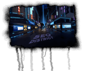
The color correction for self-generated moving images and videos helps the viewer to feel comfortable in the image composition. Imagine for a moment the world without colors. A spring without spring colors after a long, dreary winter? No thank you! Hues are indispensable in everyday life and have a direct effect on our mood. When you know how to use color in motion design, you use imagery to explore the relationships between color and human emotions. This allows you to subtly influence the viewer’s reaction to the motif or subject.
The color prism brings light into the darkness
The experiment should still be familiar from physics lessons: white light can be broken down into its components with the help of a prism. A rainbow-like color spectrum is emerging, which has three color groups:
This color circle consists of the pure color in the outer ring. If we add white, the result is a “brightening”, i.e. more brightness. Adding gray or black results in “tinting” or “darkening”. An impressive result for monochrome color compositions is provided by nature with the most diverse shades of green. Maximum contrast is obtained with opposing complementary colors.
There are two types of contrast: visual contrast (color, shape, size, position) and thematic contrast (e.g. day and night). The juxtaposition of contrary properties creates a strong visual stimulus. This effect can be used to draw the viewer’s attention and make the composition more interesting. But this almost always requires a color correction that deviates from the original.
What does white balance mean?
Light not only varies in brightness (intensity), but also in color temperature (given in Kelvin). At a very low Kelvin value (e.g. candlelight with 1,850 Kelvin) the film takes on a red cast. On the other side of the scale, there is a risk of a blue tint if the Kelvin value is high. With the white balance, the film camera can be calibrated to the ambient temperature of the light. This avoids a red or blue color cast.
Color correction in motion design
Especially in the field of fashion and beauty, there is almost no moving image that has not been retouched. It’s not just about one or the other correction for the colors. Once the shots are in the can, numerous post-production tools are available. Because nobody wants to see the notorious effects of red eyes at a sociable party night in the film. Therefore, they are subsequently subjected to a correction.
Individual settings are also made for logo and product animations. Numerous moods can be created with color grading. Tools such as LUTs are used for post-production. This means that the hue, saturation, brightness and contrast axes can be controlled separately and veritable worlds of experience can be created in Vivid Colors.